ASSIGNMENT 4 - Show me
- Christine Griever
- May 3, 2023
- 7 min read
Context
Typographers and type foundries (the companies that commission and produce typefaces) have always had to promote their latest designs to printers and designers to show off a particular typeface, its different fonts in a variety of sizes and contexts, and the unique features of it. Once Specimen Sheets were the main way of doing this. Nowadays most of that marketing takes place online – research type foundries on the internet.
Brief
Design the font for use on the cover of a magazine called type and write a short article for the magazine using a range of typefaces, with typographic illustrations, drawing on all that you have learned in this section. The article should include sections on:
• what makes a typeface interesting
• how a typeface is constructed
• question marks.
Requirements
Do a mock up of the magazine cover to show where and how your title font will appear along with other cover elements. Produce a magazine article that is attractive and interesting enough for someone to want to pick it up to read, and which shows off what that you have learnt so far about typography. Add illustrations, photographs and colours as you want.
Type Foundries
A typeface foundry designs and distributes typefaces.
While the term "foundry" originated with metal type, it has survived a variety of technological changes and still remains relevant today.
The original role of foundries was to manufacture and distribute wooden and metal type for Linotype machines and other mechanical typesetting machines. Today most foundries produce digital typefaces including TrueType and OpenType in various formats.
A foundry can be classified as:
Mega foundry (multifunctional commercial foundry)
Large Foundry (prolific partnership and collaboration)
Independent Foundry (small but significant it may consist of one or two designers)
There are several large and well-known foundries, including Adobe, Bitstream and Monotype Imaging. Type foundries can be found all over the world. (Tselentis et al., 2012)
Click on the image below for examples of typefaces from different type foundries.

Designing my own font
When I read that I had to design a font I was struck with fear, I have never designed a font before?
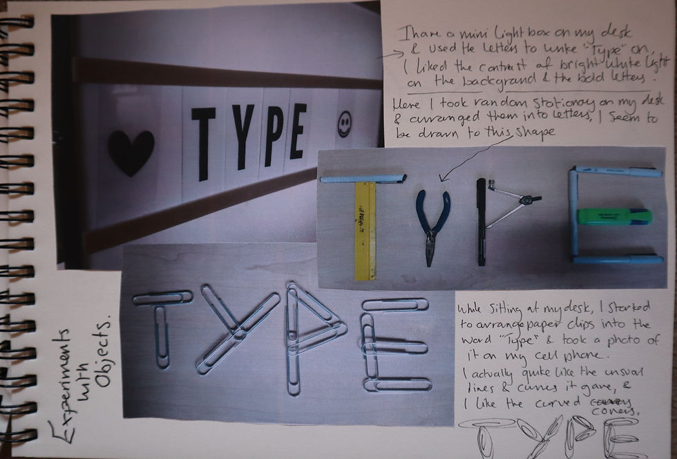
While sitting at my desk I started to play around with the pieces of stationery and arranged them into letters. See sketchbook below.
Still experimenting with letters, I thought I would try ink stamps to see if that could inspire me to create my own font.


I then looked online for some inspiration of different typefaces and how the ideas could help me design my own font. I found many exaggerated letters, illustrated letters and ones that looked like pieces of art.
Click on the image below to see more.

I started to brainstorm some ideas in my sketchbook to explore which direction I could go in.

I wanted to try designing a complete font to use for my magazine cover. I found a programme called Font Self. This was such a good programme because I could use my own handwriting and design, clean it up in Adobe Illustrator and then import the font into a useable typeface from my computer. This was such an amazing experience and I felt incredibly proud to produce a font that I could use. However, it took a few attempts to create a font from scratch and I definitely have a new respect for typographers.
Attempt 1
For this attempt I used used pen and paper to try creating a font. I used a template to make sure I stayed within the x-height and created the correct length for the ascenders and descenders as well as the cap height for when designing uppercase letters. I took the guidelines away and was left with this to scan in to the computer.


Once I scanned this in to the computer I rearranged them onto the grid in Adobe Illustrator.

Once I had done this I created an Open Type Font file.

This was exciting, but at the same time this looked rather childlike and I decided to try again with attempt two.
Attempt two
First I used my sketchbook to get a feel of how I would create my letters. I wanted a Didot feel but without the serifs, at the same time I wanted it to look modern with a handwritten script look.


I decided to use a Wacom tablet to draw the rest of the letters straight in to Adobe Illustrator. I found this technique much easier as I felt with the first attempt that I was repeating the same thing twice.
In Adobe Illustrator I used the pencil tool to draw my letters. Once I was happy with some of my strokes, tails and cross bars I copied and pasted sections to build other letters to make it look more uniform. I remembered the earlier exercise "A typographic jigsaw" and constructed my letters in the same way. I then used the smooth tool to smooth out edges that were ragged and then experimented with the width tool to create thick and thin strokes. I then grouped them together to form one letter. This took many hours, but found the effort well worth it.
Below are the jigsaw pieces I put together to build my font.

These pieces were constructed to form the letters onto a grid.

Once I completed this grid I then created an Open Type Font file.

Title for magazine cover
For the magazine cover I used my font to see if I could manipulate the look of the font to make it look like a title. I used Adobe Illustrator to play around and experiment with the anchor points by creating outlines of my font and ungrouping them so I could change them individually. I took inspiration from the exercise "playing with words" where I could extend particular letters and exaggerate ascenders and descenders.
This was my experimenting in Adobe Illustrator below.

I tried different compositions, like breaking the word "type" in two, both vertically and horizontally. For example letters "T" and "Y" on one line and then the letters "P" and "E" on the second line directly below. Then I tried the other way vertically with the letter "T" and "Y" on top of each other and then the letter "P" and "E" on top of each other.
I then played with the anchor points by selecting more than one point at a time and extending to produce a thicker weight and somewhat abstract effect.
I also tried with both uppercase letters and lower case letters to see if it looked better either way.
I used the anchor points to exaggerate the descenders of the letters "Y" and "P" and the bar of the letter "T".
While I was playing in Adobe Illustrator, I decided to make the weight on the letter "Y" extra thick to be able to write the word "magazine" into the stroke. I placed this onto a black background and made the letters white to give it contrast.
This is my final title for the magazine cover.

Front cover
I looked online to find some samples of magazine covers that were quirky and different. I found that there were many display fonts that were highly illustrated, colourful and were eye-catching. Many felt like more of a logo design than a font.
Click on the image to see more.

I went to my sketch book to play with some ideas for the layout of my cover, I knew that the cover would be quite simple because there is not much to put on the front cover as there are only three articles for the magazine. I decided to break up the emptiness on the cover, I would use a stock photo for the background.

I then used Adobe InDesign to design the front cover of the magazine. Before this I used Mila Note to create a colour palette and see which photos would work best for the cover. I asked a group to critique which cover they liked the best and why.
Click on the image to see more.

Mock-up of magazine cover

Articles - Double Page Spreads
In my sketchbook I wanted to experiment with the composition of the articles, I knew I couldn't fit in all of the information on one page, so I decided to arrange the articles over two double page spreads. I gave each article a different look and feel.


In the link below I discuss why I used the typefaces I did and elements of the layout.
For more detailed information please click on the image below.


Article one - How is a typeface constructed & Question mark? Article two - What makes a typeface interesting?
To read the article press the button below.
Mock-up article - How a typeface is constructed & Question mark?

Mock-up article - What makes a typeface interesting?

Reflection
Designing my own font was daunting! I didn't really want to design a font that looked like a logo and went down a more simple traditional route. In the beginning I sketched ideas and played around with items on my desk, at times purely because I was procrastinating about how I was going to achieve this. My ah-ha moment came when playing with paperclips. I was thinking about the rounded edges and my first starting point was making the letters a sans serif. During my time working on this unit I researched the typefaces from the modern era Didot and Bodoni. In these typefaces the stokes are both thick and thin giving a different contrast to the other serif typefaces like Baskerville.
Drawing inspiration from Didot I knew that the edges had to be rounded and without serifs and the strokes a different weight. Using my skills in Adobe Illustrator I remembered that there is a width tool. I experimented with what I could achieve playing around with this tool. I then realised that I could change the a stroke that had both thick and thin strokes within the one stem of a letter.
Getting quite excited I then used a programme called Font Self, I used a template to draw by hand via my Wacom tablet onto the computer making sure that my lowercase letters and capitals letters stayed within the guides with the pencil tool. I then carefully crafted each stroke and stem of each letter by using the width tool. Although this took hours and hours to do I then constructed my letters together like a jigsaw puzzle (this reminded my of the earlier exercise "typographic jigsaw puzzle").
My typeable font was born! This was such a great feeling to have a font that I could actually use on my computer and type with like the other installed fonts! I only created one font for this typeface and later on I will go back and make bold and italic fonts to add to the family.
I enjoyed making different compositions of my letters in Adobe Illustrator by turning my letters into outlines and moving the anchor points to exaggerate the different elements of the letter. While doing this I could make up compositions for my magazine cover.
I also really enjoyed creating layouts and applying my knowledge of hierarchy to the spread. It has been a while since I used Adobe InDesign so it was good to get back into using the programme again. This time working across the Adobe packages to get the best result with the magazine layout.
Although daunting in the beginning, I am really happy with how the magazine articles turned out and I really enjoyed creating them! I realised I have learnt so much in this unit. I have much more respect for the amount of work that goes into creating a typeface and that typographers spend an insane amount of time to get them correct.
Comments