RESEARCH POINT - Typesetting
- Christine Griever
- May 3, 2023
- 3 min read
If you haven’t already, now is the time to collect as many newspapers, newsletters, magazines and brochures as you can. Start by going through them and dividing them into the ones that immediately look easy to read and those that don’t. Is this due to the typefaces used, the way the type is laid out – the number of words per line and the column width, or its alignment? Work out from your examples what the designers have done to make things more legible and readable. Make notes in your learning log. Then do the next exercise.
Collection
I first started by collecting magazines, newspapers and brochures to get an idea of how each of these used type and how the publication is laid out.

From the samples I collected I took photos of the double page spread for the magazine and looked at the overall presentation, such as the typefaces used, the colours and the fonts. I also looked at which texts were easy to read and which texts were hard to read and sorted them into columns.
Click on the image to see more.

Typesetting Experiments
Alignment
In Adobe InDesign I started to play around with the different type settings. The first experiment was with the alignment. The font size was set at 12pt. I used placeholder text to create blocks of text. It was interesting to see how the blocks of text behaved when the settings were changed. The most interesting was when all lines were justified. Although this made the block of text look very nice, it did create huge gaps in-between the words. This makes the text hard to read. All the text that was left aligned was easy to read, and the right aligned was harder to read but would be easier to read if there was not so much text.


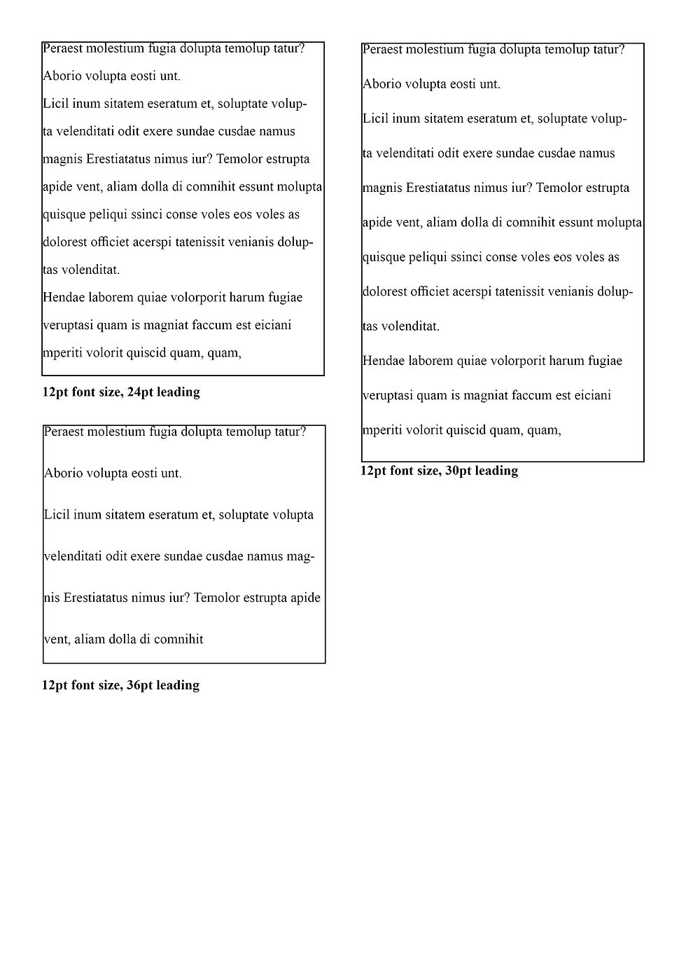
Leading
With this experiment I use two different typefaces to see how the leading would look. I used Times New Roman a serif typeface and a sans serif typeface Arial. I found that the sans serif typefaces take up more room on the page even though they are set at the same font size of 12pt. I played with leading from 14pt to 36pt. I found that reading after 16pt - 18pt becomes very difficult as it no longer looks like a paragraph.


Tracking
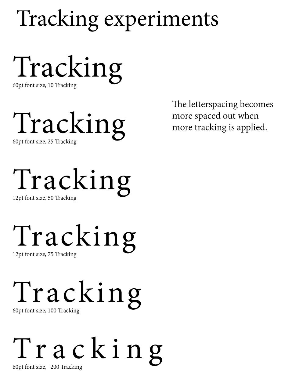
In this experiment I played around with the tracking. I set the font at 60pt and started at 10pt tracking which made all of the letters in the word have more space between them to -100 pt which made the spaces between the letters a lot smaller. For a block of text I don't think this would make the text easier to read, however, if the word was used as a heading or logo then tracking would be very useful to create different looks.

Kerning
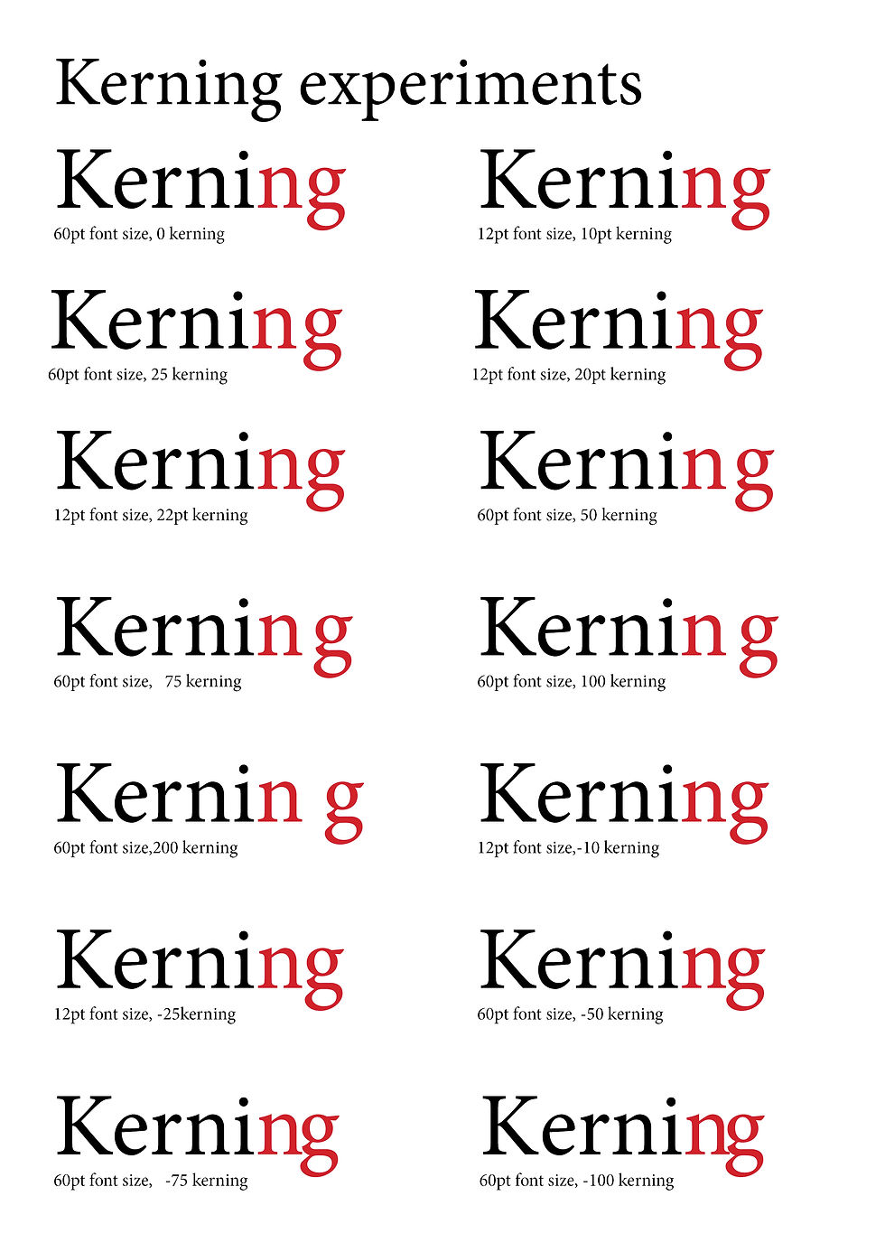
With this experiment I took the letters n and g to play around with the kerning. I think if the kerning is set to 0 then there shouldn't be a need to adjust the kerning for a block of text. However, as with the tracking, if the word is a heading or logo then this could be very useful.
Reflection
I found collecting different examples of text and their layout interesting and when I sorted the collection into easy to read and hard to read it made me understand the importance of typography. Once I had been through the sorting process and summarising why the collections were hard to read or easy to read, I wanted to play with Adobe InDesign typesetting features to see how I could change the appearance of a block of text but also to see how much it would change when I went from one extreme to another. All the adjustment features have their place, but it has to be used in the right way, for example leading at 36pt won't work for a block of text in a book. However, it could work for a questionnaire where space is needed for a handwritten response.
Comments