RESEARCH POINT - Visual Literacy
- Christine Griever
- May 3, 2023
- 4 min read
Research the work of graphic designers that interest you. How do they use visual language? What is it about the work that you admire? Make notes on their work, your reflections on it and note down aspects of it that you could use as a starting point yourself.
Paula Scher
Is an American graphic designer she has designed for companies such as Bloomberg, Tiffany's and Citibank, (see Fig. 1). She is also known for her intricate typographic map paintings (see Fig. 2), below, as well as designing for cultural institutions like the Public Theater and the Metropolitan Opera. (Roberts, 2015).

Fig. 1 Citibank logo (1998)

Fig. 2 Paula Scher’s mind-bending maps, PRINT Magazine (2020)

How do they use visual language?
In the poster "The Diva is Dismissed" (see Fig. 3) visual language is utilised by lines and text coming out the mouth. The font has different mixes of weights and spacings and delivers information that is expressive and powerful. The poster doesn't follow the traditional hierarchal structure and the focus is on the mouth and the words coming out advertising the show. The poster stands out with the bright yellow background, bold black font and the blue face to give the contrast.
Fig. 3 The Diva is Dismissed, Paula Scher, 1994 (2022)
What is it about the work that you admire?
I'm drawn to the bright colours and the way words are used, not just to give written information, but used in conjunction with the image to give the impression that the image is speaking the words. I like that the poster is simple and eye-catching.
How do they use visual language?
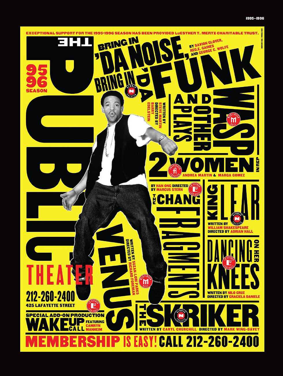
This poster (Fig. 4) uses a powerful contrast with the bright yellow background and the bold black font. There is a vast amount of information on the poster but it is laid out and styled with lines that are appealing and eye-catching. The photo draws your eye to the poster giving the instant feeling that this is fun and engaging.
There are only four colours used in the poster and all the colours complement each other. The Public Theatre branding is still clear and visible.
Fig. 4 Bring in ‘da Noise, Bring in ‘da Funk, Paula Scher, 1995 (2022)
What is it about the work that you admire?
I admire the bright yellow colour and the way the writing is arranged vertically and horizontally into the different shows, all using different weights and font sizes. For more of Paula Scher's works, please click on the image below.

‘Find out what the next thing is that you can push, that you can invent, that you can be ignorant about, that you can be arrogant about, that you can fail with, and that you can be a fool with. Because in the end, that’s how you grow’ - Paula Scher (Roberts, 2015)
Reflections
I choose Paula Scher as one of the Graphic Designers that I'm interested in because she is female and fearless. When I was watching her TED talk she spoke a lot about play and gambling. There were many projects that she felt she wasn't qualified for but still undertook them. She learnt about being brave enough to just experiment, to play and have fun with the project she was working on. I saw the same spirit come through in the Netflix documentary that also expressed the element of play. Her branding of the Public Theater and how she came up with the logo by using old type and giving each letter a different weight I found fascinating. In my own work I will definitely experiment more with typography in my designs.
Milton Glaser
American graphic designer Milton Glaser (June 26, 1929 - June 26, 2020) was well known for his "I Love New York" logo and a 1966 Bob Dylan poster. He also designed logos for DC Comics, Stony Brook University and Brooklyn Brewery (Wikipedia, 2022).

Fig. 7 DC Comics logo, 1977–2005 (1977)
How do they use visual language?
This design is so iconic that it is reproduced all over the world. I had no idea that the designer behind this iconic logo was Milton Glaser. The design is so simple but also memorable.

I like this logo because it only has two colours and instead of using words he just used capital letters and a red heart symbol to create the powerful effect. The slab serif typeface is also impactful in its look. The logo was inspired by Pop Artwork called LOVE by Robert Indiana. (See Fig. 9).
Fig. 8 I Love NY (2020)

Fig. 9 Robert Indiana, Love 1967 (2022)
What is it about the work that you admire?
I admire the simplicity of the logo and how powerful and dynamic it is. Mixing the symbols like the heart and using letters is clever and impactful. It makes me think about how I could make designs simpler by using symbols to convey a message.

Fig. 10 Poster for Bob Dylan's Greatest Hits, 1967 (2020)
How do they use visual language?
This poster (Fig.10) has a silhouette of singer Bob Dylan and is contrasted with strands of tangled rainbow psychedelic hair, the typeface is Milton Glaser's own designed font called babyteeth. (See Fig.11)

Fig. 11 Baby Teeth 1968 (2022)
What is it about the work that you admire?
I admire that Milton Glaser designed his own typefaces and used it for the Bob Dylan poster. I admire the poster because of the different colours used for the hair that is psychedelic, fun and from the era that was pushing the boundaries of traditional fine art and going in a bright bold direction. I like that the profile of Bob Dylan is instantly recognisable so the design didn't need to feature any facial details and the silhouette was simple enough to convey the message.
Type faces
Milton Glaser also designed the following typefaces
Art Decko
Babycurls
Babyfat
Babyteeth
Eightway
Futura Stencil
Glaser Stencil
Houdini
Rainbow!
Stencil Select
(Wikipedia contributors, 2022)
Click on the image below for more typefaces.

‘We are all born with genius. It’s like our fairy godmother. But what happens in life is that we stop listening to our inner voices, and we no longer have access to this extraordinary ability to create poetry.’ - Milton Glasser (Roberts, 2015)
Reflection
I chose Milton Glaser as a Graphic Designer that I admire because he quotes "Art is work", art is a way of understanding the world. Designing an iconic logo "I heart NY" was so simple and effective that it has been replicated all over the world on all kinds of products and merchandise that you can imagine. His style of work is bold, colourful, fun and at times psychedelic. I admire that he was versatile with typography, graphic design and illustration and could seamlessly utilise all these areas into his work.
Comentarios